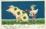
We’ve had the drawing of a sitting pig for a while. It wasn’t really intended to be the official farm logo. I drew it for an early advertisement we printed, and with one thing leading to another it “stuck”. The art was ripped off from this (public domain) postcard dated 1908. Germans sure love their good-luck pigs, but that’s a topic for another day…
Because the logo selection wasn’t intentional, I’ve never been happy with the way it pigeonholes us as a pig farm. Yes, pigs are my favorite animal. Yes, I like the look of the drawing. But we raise cattle and lots of chickens too. And the farm is more than just the animals; it is the land and the people and the water and the mosquitos and on and on. How do we convey the totality of the farm in one evocative image?
One approach for a new logo is simply to add more critters. There are many diversified farms that have taken a similar tack, drawing each farm animal in profile, either lined up, nested, or stacked up in an ascending tower. I like that, but it is a pretty common formula.
Rachel and I were brainstorming and it occurred to us that very few farms use chin-forward profile shots for the animals, and even fewer have the foreshortened effect that you often get when photographing an animal that is interested in sniffing, pecking, or eating the camera. Rachel sketched up line drawings based on the three beasties below, with the goal of having all three sharing the logo.


I like the whimsy in these pictures and I think they reflect well on the fact that Wrong Direction Farm is not a pretentious institution. They show the trust the animals have for us, and they are distorted enough to indicate that none of us takes ourselves too seriously. But the problem is, where does inclusion stop? We are working on plans to raise turkeys this year. Should we add turkeys now even if we don’t have them? What about ducks? What if we stop raising one group of livestock? What if we start selling our garlic and pumpkins? What needs to be in the logo and what should be left out?
Thus our thoughts turned to what the farm is really about. Above all else, this is a pasture farm. Perennial pastures are central to everything we do. Our work is all dependent on taking care of the plants that take care of the soil that takes care of everything else. So that led us to think about grass and dandelions and clovers and burdock and all the other wonderful plants and weeds that make our pastures great. But what about the unseen side of things? What about the roots? What if we show them too; what if they dominate the image?

Our latest ideas are somewhere along the lines of the cover of this book by Wes Jackson. I am not enthusiastic with this illustration, but I like the idea that the unseen roots are much deeper than the aboveground growth. And that encapsulates much of our aspiration for the farm. We want to show that the behind-the-scenes world is complex and messy and essential.
We’d prefer to stick with a stark black and white drawing. A successful image will convey the diversity and connectedness of pasture plants, while avoiding getting literally down in the weeds and rendering the drawing pedantic.
We aren’t done sketching it out, and we’ll probably need some professional help to get a good vector drawing before we have anything to reveal to our customers. But until then, feel free to drop us a line to let us know any thoughts you have. If you are our customer, what image encapsulates your ideas about our farm when you are scrambling an egg or grilling a ribeye?